Linneartist
A revamp of an identity to better represent myself and my skills.

Category:
Branding, Logo Design
My Role:
Designer
A new alias with a funky feel
I struggled to brand myself for the longest time. There was one (I believe Tumblr) post that kept coming into my mind as I would sit down and brainstorm logo ideas, search for good font pairings, and research colour palettes:
"Brands are becoming human, while humans are becoming brands."
And oh boy, I did not like that.
I was taught throughout my entire design life that I needed to present myself as the future employee I want to be, not necessarily who I feel I am. This meant to follow the trends, focus on minimalism, present myself as prim and proper and sophisticated (whatever that means)… This meant to whittle the truly creative and innovative parts of me down to a barebones imitation of great designers who came before me.
I adhered too strictly to guidelines and the "correct" way of designing things. I strived for harmony, for balance - not taking the time to understand that a difference of 1px is not the end-all-be-all I thought it would be.
In fact, what is life without a little mistake? Nothing in nature is perfect. We have a Golden Ratio that proves that nothing has to be perfectly centred. What I was lacking in my "branding" was an organic aspect - something that showed my illustrative background. Something that felt natural to me.
So, I set out to customize my own typeface, reminiscent of the calligraphy I love to do by hand. I call it my "swanky logotype." The L, N, and S in my stylised logotype are to showcase how each letter doesn't have to be exactly the same, and just as rivers follow the natural contours of the earth beneath them and tree branches bend and twist as they grow upwards and outwards, I wanted to prove to myself that I am more than just a manicured sans-serif: I am whoever the hell I want to be.
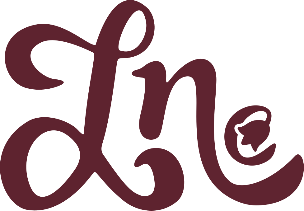

The Linnea Flower
The Linnea flower has seen many iterations since evolving into what it is today. Serving originally as the "e" in my name, later as the "L/e" combined, and now back to just the "e," the overall form has remained the same, with tweaks to better suit the typeface it goes along with. P.S.: notice the little leaf details on the "is"!
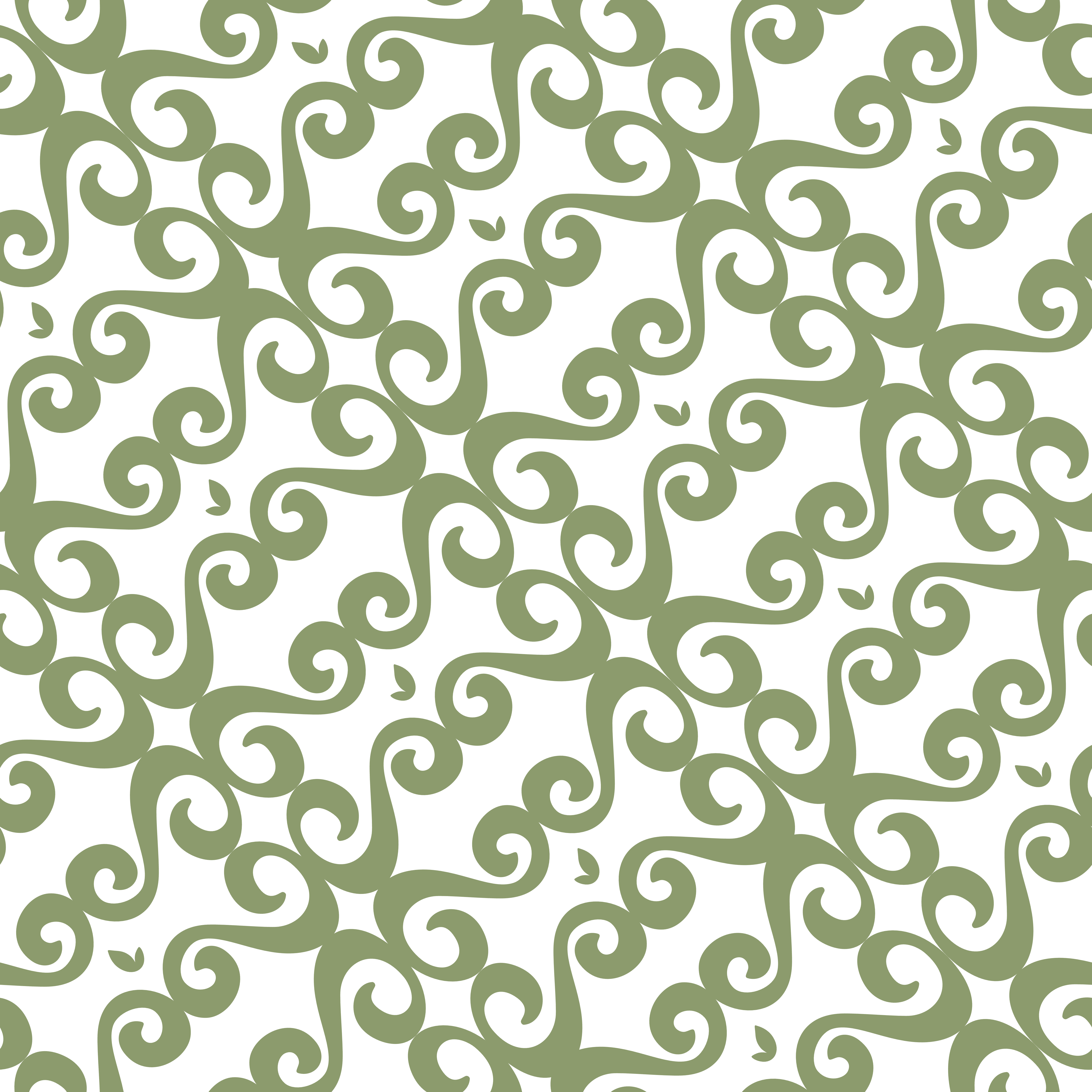
I created a pattern using the swirly S and my little leaf details (that serve as the dot on an i).
Other Projects

